SOMA | LOGO DESIGN
Soma is a secure, client-owned mobile app which stores therapy records, giving people continuity of care when they change therapists.
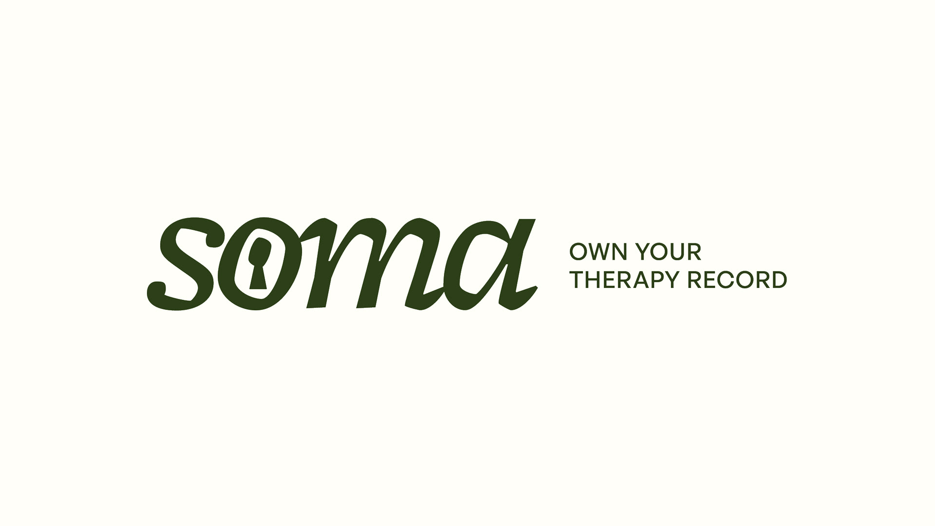
The logo focuses on security and ownership - soma, the key to your records.
I also selected brand colours and typography for their soft launch. These were chosen to transmit a softer human feel in an industry that often feels overly clinical and cold.
The logo focuses on security and ownership - soma, the key to your records.
I also selected brand colours and typography for their soft launch. These were chosen to transmit a softer human feel in an industry that often feels overly clinical and cold.
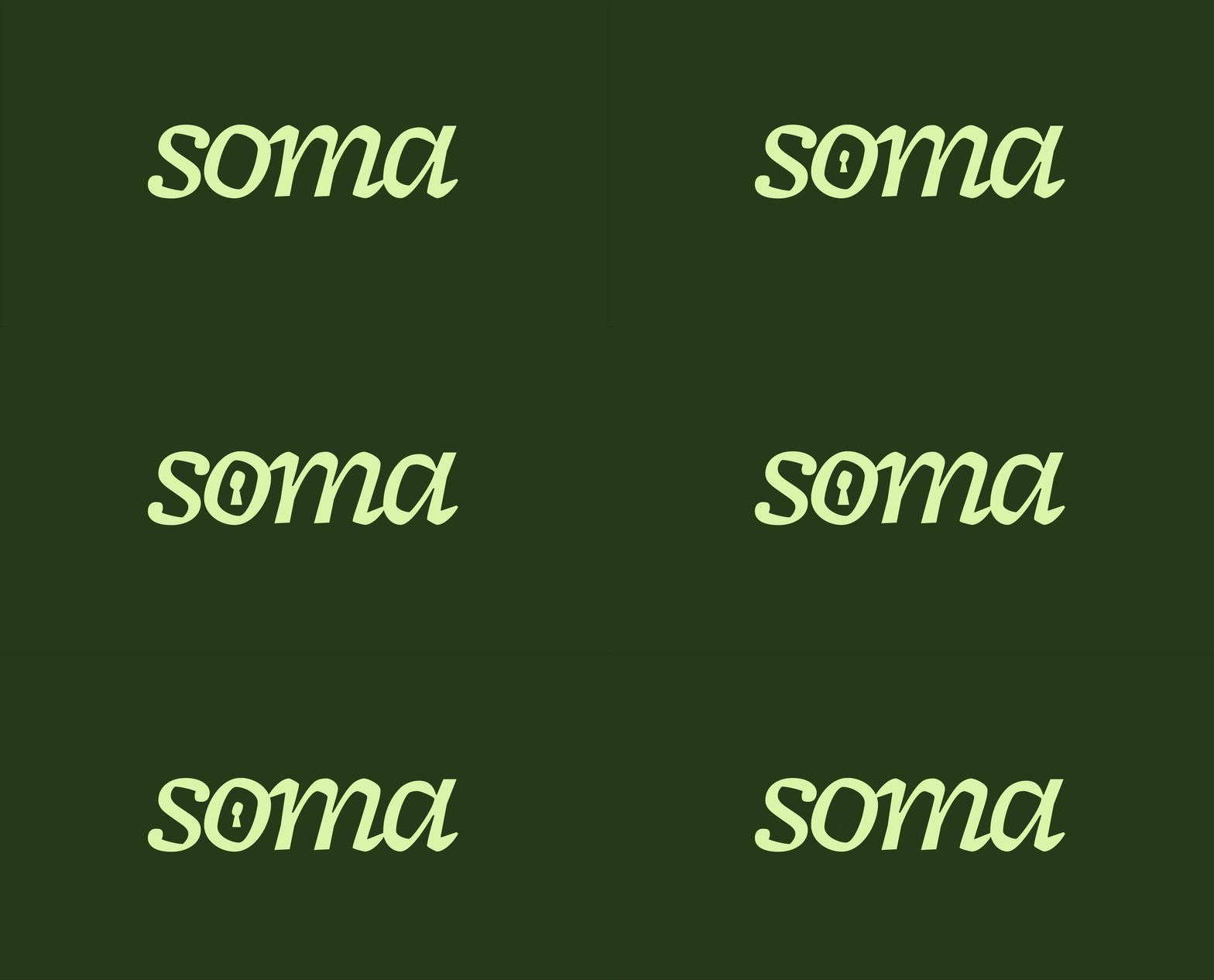

Considering it's a logo for an app, responsiveness was an important aspect of it. The logo has a few iterations, shrinking down to an icon which comes to live through animation to maintain brand presence whilst creating a more engaging experience.
The team
Design: Beli Heredero
Design: Beli Heredero